How to find your creative style with “Split Toning”
 In my opinion, the most underrated tool of Lightroom is “Separate Tinting”. Meanwhile, this is not only a great opportunity to correct many problems in a photograph, but also a great way to develop your own creative style of image processing.
If you are not familiar with “Separate toning”, then its essence is the following – you apply a specific shade separately to the shadows and lights of the picture in order to get the separation of colors without changing the brightness.
Below is a great example of how Split Toning works. This is a standard gradient map, from pure black to pure white, which demonstrates how shadows translate into light:
How to find your creative style with “Split Toning”
If we go to the “Separate Toning” module in Lightroom and apply the yellow tone to the lights and the blue tone to the shadows, then the gradient map will look like this:
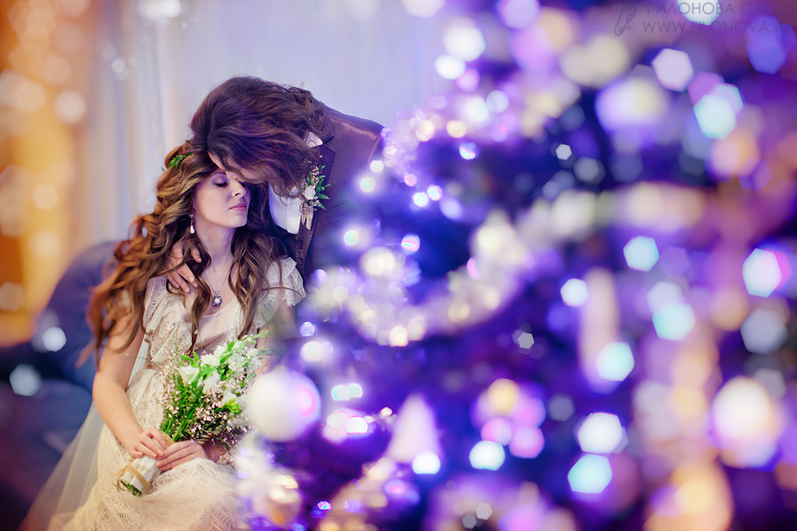
In this example, I want to add a warm hue to the lights so that the scene looks more like the one I saw when shooting:
There are several ways to choose the tones used, but I advise you to use one trick: by moving the “Color tone” slider, hold down the Option key on a Mac or Alt on a PC — this will show the saturation of each tone by one hundred percent, so that it is easier to determine the desired shade.
When you decide on the color you want to apply, simply release Option / Alt and drag the saturation slider to the desired level.
Another choice is to click on the rectangle in the upper right corner above the lights and shadows, and then use the eyedropper to select the desired color.
After the desired tones are selected, with the help of the “Balance” slider, you can make more emphasis on highlights, shadows or leave it at the value 0, so that both get equal weight.
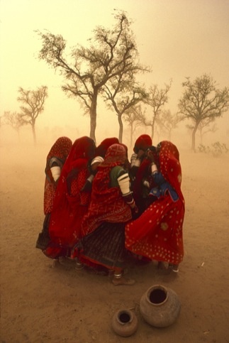
Below – what happened after the application of separate toning.
We were able to make the lights warmer and the shadows colder using the cinematic combination “teal and orange”. This is an excellent example of how to correct a problem and at the same time approach the post-processing somewhat more creatively.
When you find a combination of highlights and shadows that you especially like, you can simply save these changes in “Separate toning” as a preset and then apply it to any other images. This is a great way to save time and give all your pictures a distinctive style that will allow you to develop your own creative “handwriting”.